Some history
Symbian^3 was meant to be the first step in a "new generation" of Symbian user experience. However, Nokia seem to be loathe to make wholesale changes to their UI, and have had a pretty consistent visual experience in their Symbian phones at least since S60 3rd Edition in 2005, underpinned by the Nokia/S60 Sans typeface.1
The iPhone came out in 2007 with Helvetica throughout (except the Notes app; thankfully, John Gruber cared enough to hex-edit the app to change it. For Android, Google needed a typeface that they could distribute gratis; they commissioned Ascender to come up with a typeface family for mobile devices, which became Droid. Palm turned to Font Bureau for their popular Prelude font as used throughout WebOS. Windows Phone 7 uses a font from the Segoe family which was introduced in Vista.
You have no idea how much the people cheered when early theme screenshots for Symbian were rendered in... plain Verdana.
Nokia recently announced a new corporate typeface family, "Nokia Pure", developed by Dalton Maag. It even comes with its own exhibition. (I must admit though, I was much more excited about going to see Stormtroopers in Stilettos, until I learned it closed a fortnight ago. I guess I will have to make do with the Doctor Who Experience.) Anyway, they've announced that all their phones will end up using this typeface. Even though they said they wouldn't make changes to the Windows Phone 7 UI, in order to try and drive consistency. We'll see how that one plays out.
tl;dr: Fonts matter to some people, like my friend Perry.
Thanks to its use on the Nokia Brandbook, you can download the typeface (the Text and Headline variants). And then, you can install it onto your mobile phone, and see just what tomorrow will look like, today.
Some implementation
It is possible to change the system font on a Symbian^3 phone, so we can get an idea of what Nokia Pure will look like on a handset, and you can install it yourself today.
The Ovi store lists an application which can apparently change the font from a nice UI. Apparently the £4 version is not compatible, but the limited free version is - either way, I've ignored this option. The standard advice is to copy the TTF to your mass storage, with four copies under four different names. MyNokiaBlog tells you how to do this, so I won't go over it here.
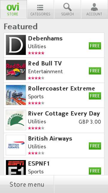
Until recently, if you did this, you would break Qt applications - which includes the Ovi Store. Thankfully this bug is fixed in Qt 4.7.2. The only way to get that at present is by downloading the Nokia Qt SDK. Thankfully, someone has downloaded it for you and put the 3 .SIS files up on the 'net. Of course, you shouldn't randomly install software on the Internet, but they do appear to be the correct versions as they are signed by Nokia. This should also be fixed by an update of the Smart Installer, though apparently not until the end of May.
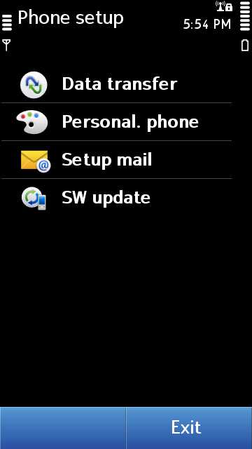
So, after all of that, what does the future look like? Not too different from the past.
But, Qt applications work!
I suspect it would look nicer if I could find the TTF for the 'light' weight of the font. This will probably escape in the next week or so.
Some suckage
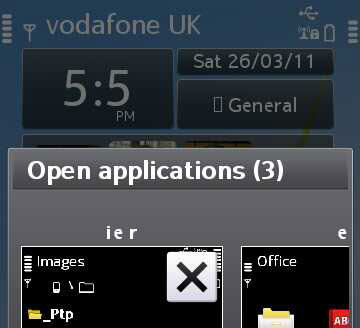
I did all this months ago with the Droid Sans font — I would rather have nice text rendering than the Ovi Store — but reverted to play with Nokia Bubbles. Only the Qt problem has been solved since. If you install your font to your mass storage2 and you plug your phone in by USB, it can no longer read the font to draw letters it doesn't know about. "File manager" becomes "i e r" in the, erm, "Alt-Tab box" below.
Also, some of the icons used on the phone appear to be characters in the font, which don't exist outside of Nokia Sans. See the square next to "General". I have only tried English - I wouldn't be surprised if this rendered painfully in any other language.
Hopefully with the release of the fabled UI firmware update this summer there will be a nice shiny new look to enjoy, but until then, enjoy your slice of what passes for "bleeding edge" in the Symbian world.
- Amusingly, S60 phones from people like Samsung used this font, and the Nokia Tune ringtone, which was renamed the Samsung Tune! ↩
- It's the future. Why do we still have this distinction exposed? ↩


 Subscribe with a news reader (RSS)
 Have new updates sent by e-mail
hats off to good effort and step by step guide. looks better than nokiasans but type rendering of those screens looks all kinds of wrong, not at all what the font looks like in os x fontbook. example: typing 'Open applications (3)' looks totally different in fontbook than up there
so what's happening? I'm not a tech expert, but typographically looks like symbian is somehow applying a fake bold and horizontal stretching to it which seems to mess up kerning. also looks like something breaks in the process, see the inside of the e letter. maybe the ui font isn't the same as the webfont, or maybe symbian is set up tp do something funky there.
[...] tip Craig’s Blog for Nokia Pure [...]
[...] Craig Box's journeys, stories and notes... « Putting Nokia's new "Nokia Pure" typeface on your Symbian phone [...]
[...] change in their first major update... new icons. So long, recognition. They didn't even put the new Nokia Pure font on [...]