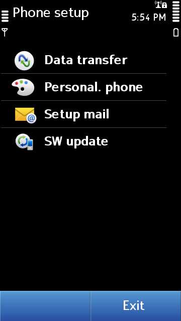
After my scoop on the new Nokia Pure font yesterday MyNokiaBlog posted a new tutorial on how to update the font. And then, "GI@" (I have no idea how to pronounce that, it's Italian) from Art4Symbian.com posted a fixed version of the font, with the correct symbols for the main homescreen, and a much nicer weight. Compare and contrast old vs new:
I don't know the pixel density of the N8 off-hand, but these screenshots don't half get big when you put them on a computer!
On a somewhat related note, four more days until the end of operations at the Symbian Foundation. I considered reviving #symbiancountdown for the occasion (and in December also), but never more than 12 days beforehand, which ruins the best joke.


 Subscribe with a news reader (RSS)
 Have new updates sent by e-mail